Inner:Outer
Inner: Outer is a wellness practice led by Zoe Weber rooted in the space between : between inhale and exhale, doing and being, the inner world and the outer expression. It’s in this liminal space where clarity emerges, tension softens, and transformation quietly unfolds.
Inner:Outer
“Rooted in the space in-between.”
OVERVIEWInner:Outer approached us at a pivotal crossroads: their business was ready for it’s next stage of growth, but their brand identity remained anchored to the past. Founder Zoe felt a growing disconnect; while the original brand served its purpose, it lacked the distinct world she envisioned. To reach its full potential, Inner:Outer needed to break away from the predictable aesthetics of the wellness industry and embrace a more singular, captivating visual language.
THE CHALLENGE
Our mission was to dismantle the wellness-standard and rebuild Inner:Outer as a category of one. We sought to bridge the gap between grounded depth and whimsical play, culminating in a cohesive digital ecosystem designed to optimize both user joy and business conversion.
THE RESULTS
COMING SOON.
Read on to learn about our approach.
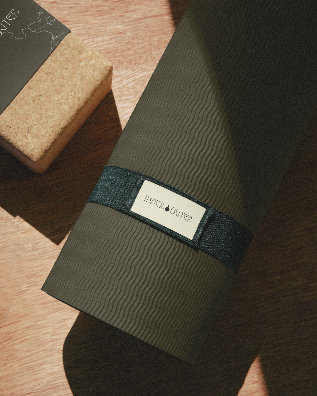
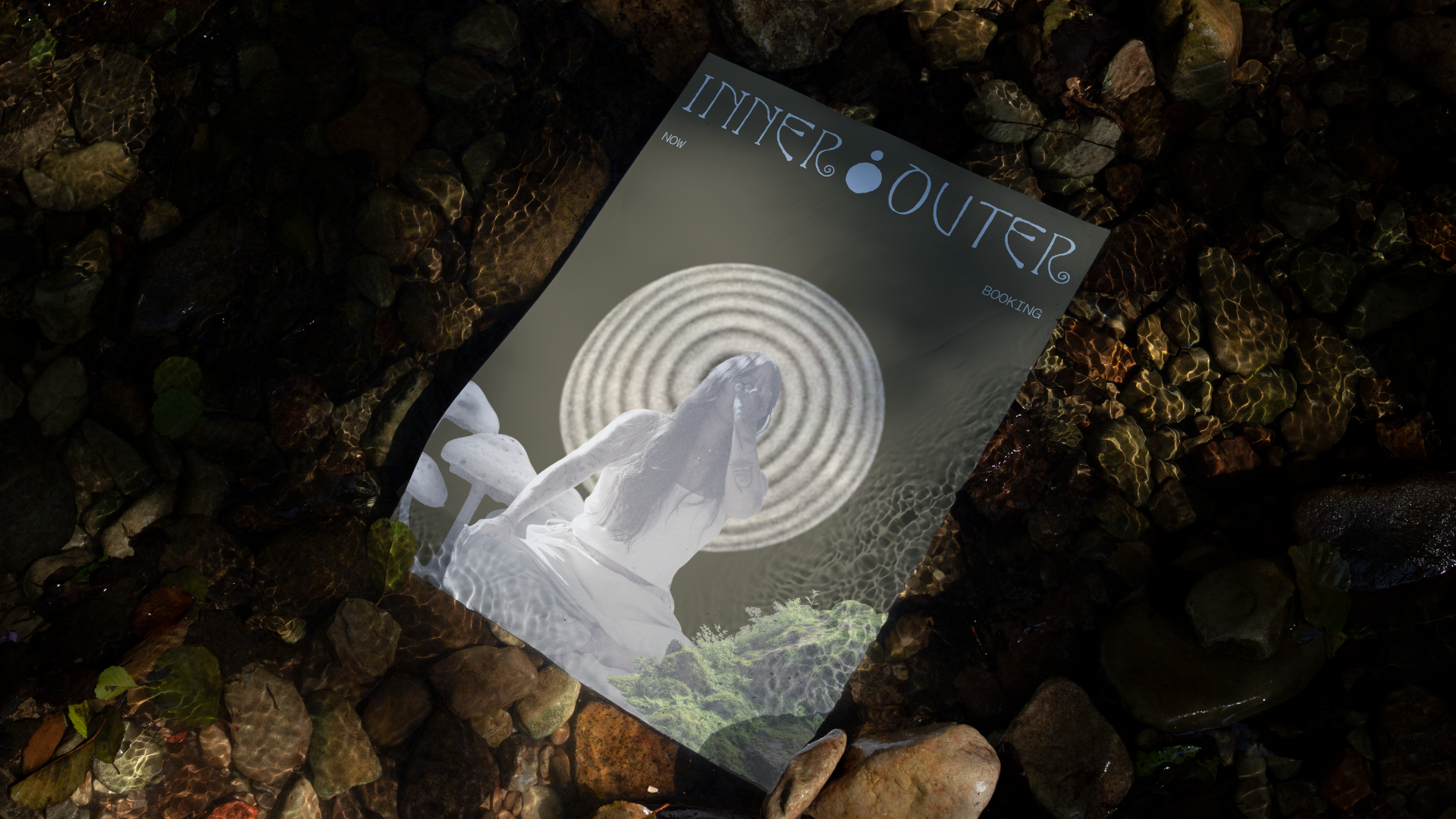
SERVICESVISUAL BRANDING
WEBSITE 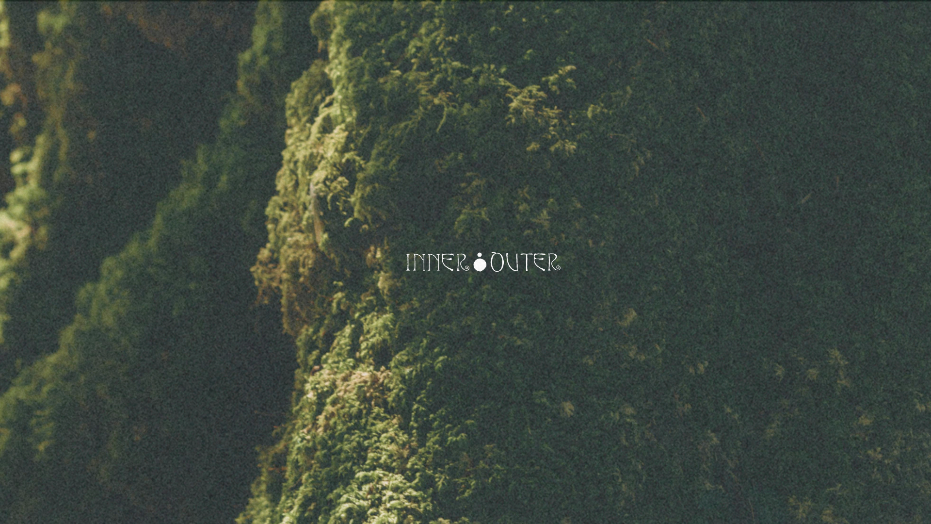
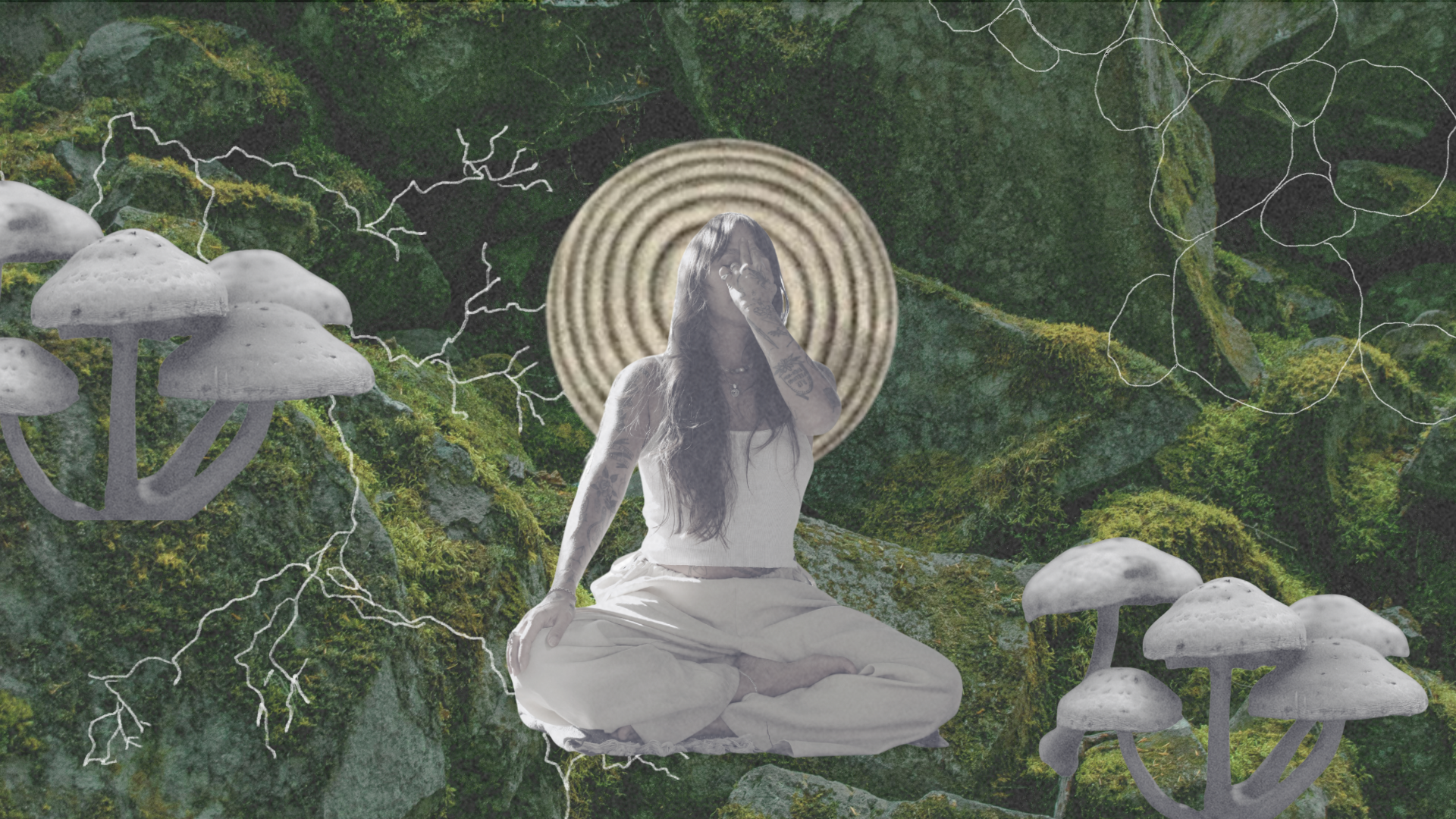
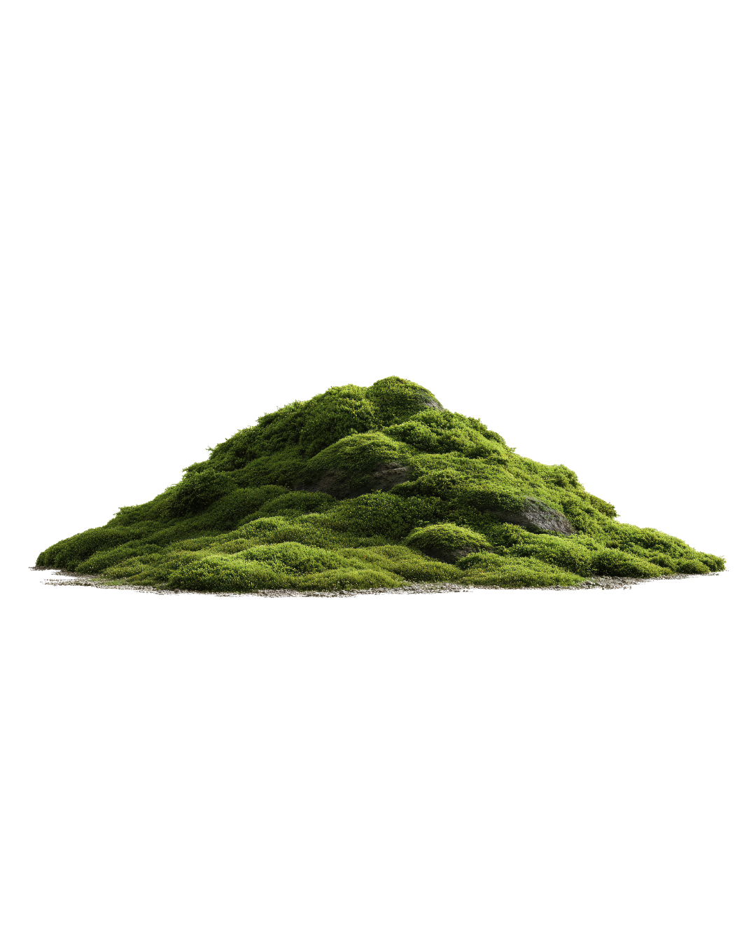
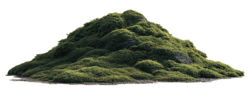
THE APPROACHWe imagined the spirit of Inner:Outer as the mossy floor of a Redwood forest. Lush and full of a mystical curiosity, the brand evoked feelings of depth, grounding, and a touch of playful whimsy. We knew Zoe’s Midheaven in Virgo in Astrology meant her brand’s natural positioning was to be seen as a brand that brings clarity and a systemized approach to wellness — treating breathwork, yoga, and microdosing as tools that can be incorporated into your daily life.
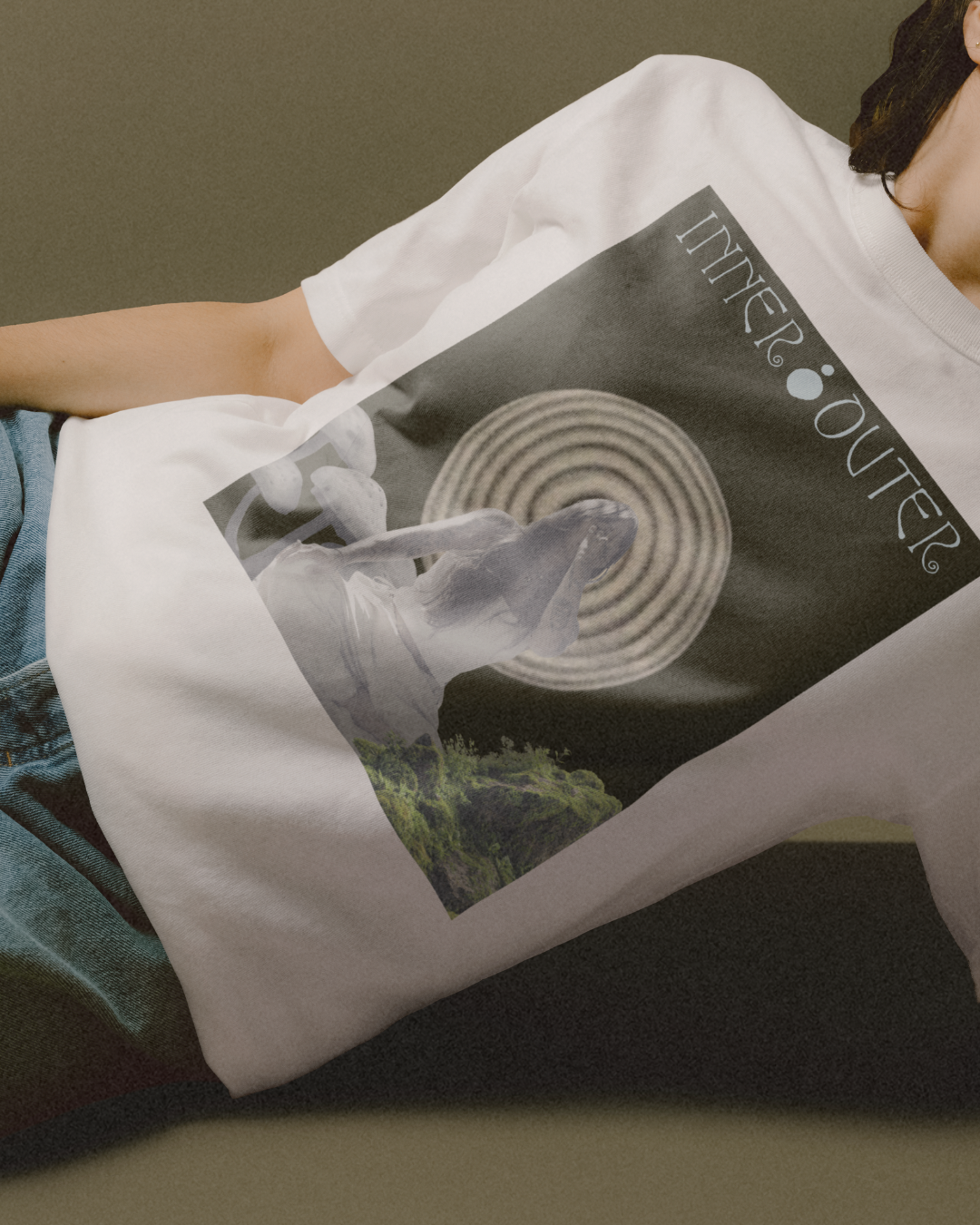
We also knew that her brand’s essence would favor a more earth-tone color palette, set against a clean and organized aesthetic. Bridging these insights, we approached translating the energy of the brand into a deep, rich color palette of various greens that are harmonious with the mossy forrest we visualized and the depth of the inner world, and added a punch of light blue to represent the sky above the Redwood trees, and the expansion of the outer world (harmonious with the breath).


The challenge was to design an identity that felt deep and grounded, while communicating playfulness and whimsy.
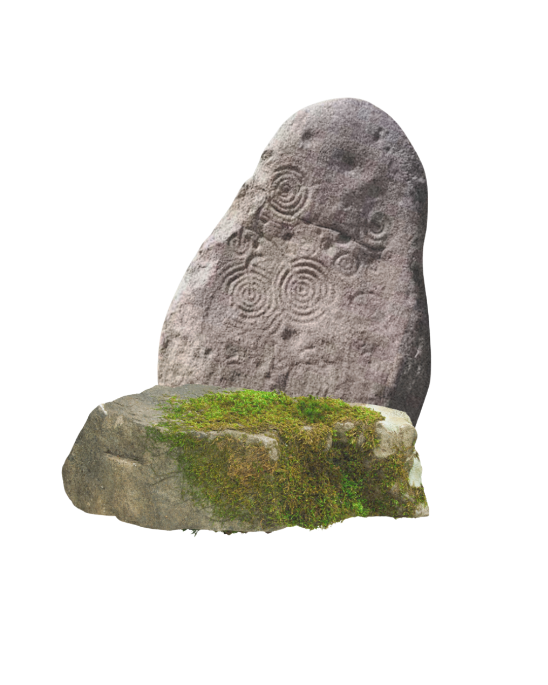
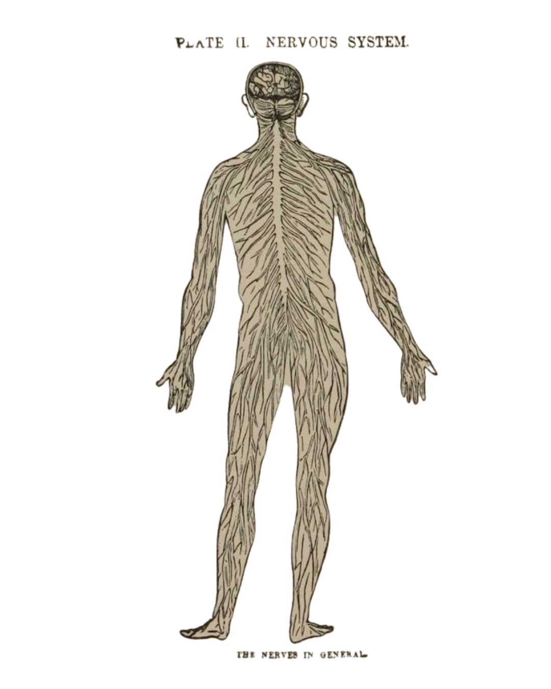

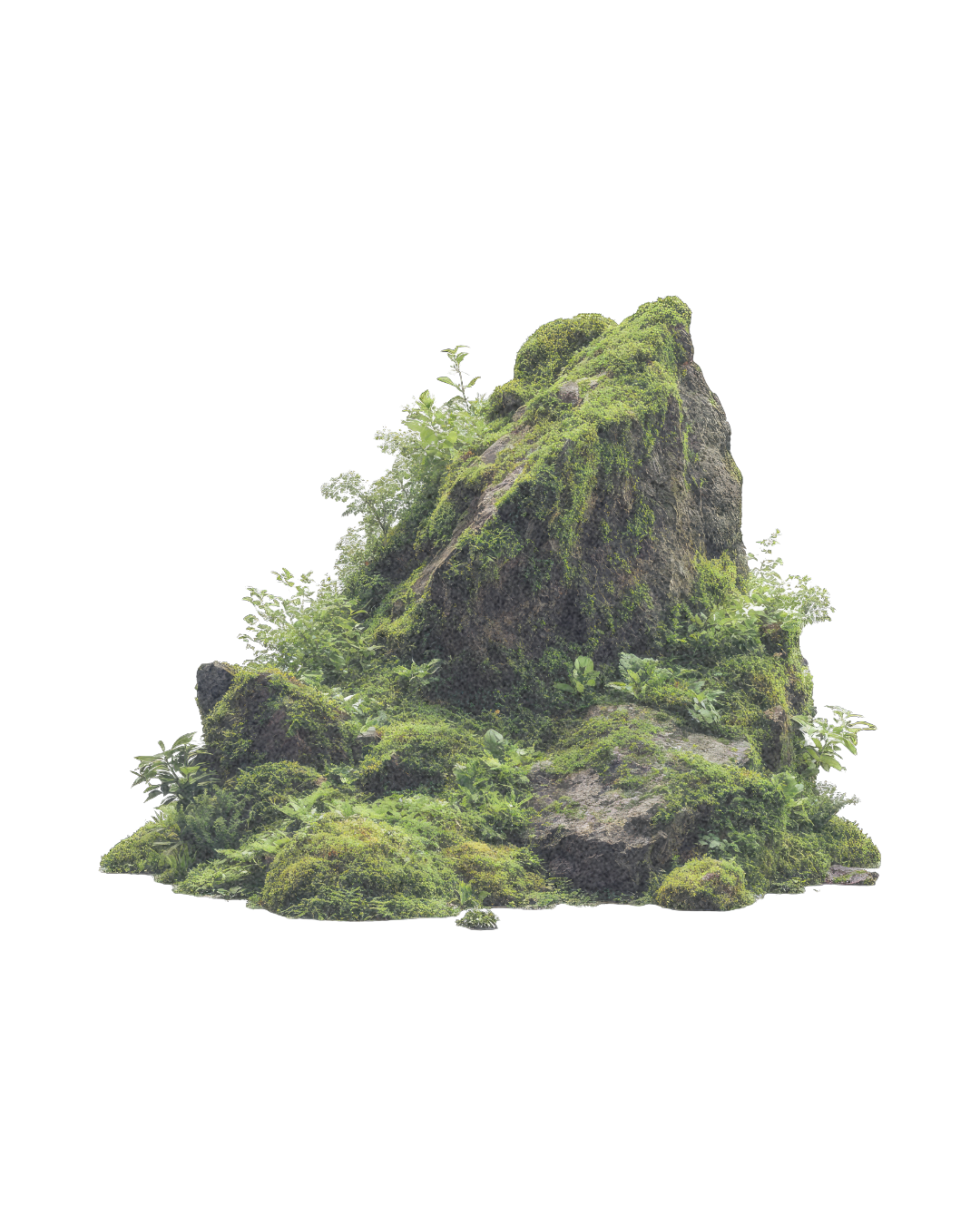

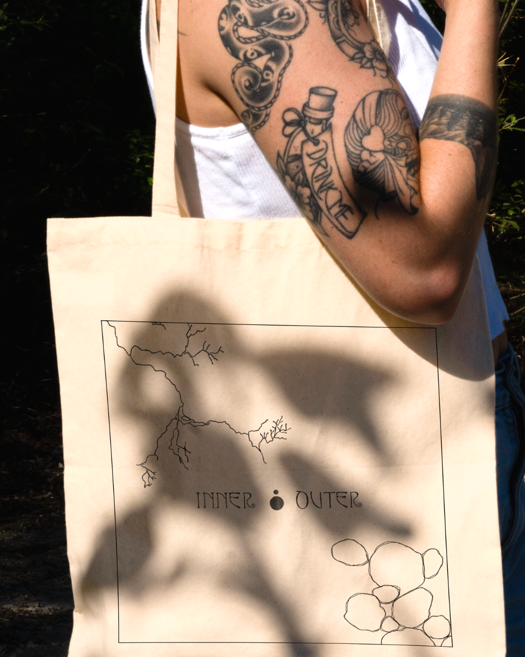
Inspired by the architectural parallels between nature and biology, we ventured into the Northern California Redwoods to source Inner:Outer’s visual DNA. From tree roots that resemble neural pathways to moss formations that mirror cellular life, every pattern was intentionally selected to bridge the gap between our inner selves and the outer world. The result is a symbolic identity that feels both ancient and alive. This process ensured that the brand wasn't just 'inspired' by nature, but literally built from the textures of the Northern California landscape.
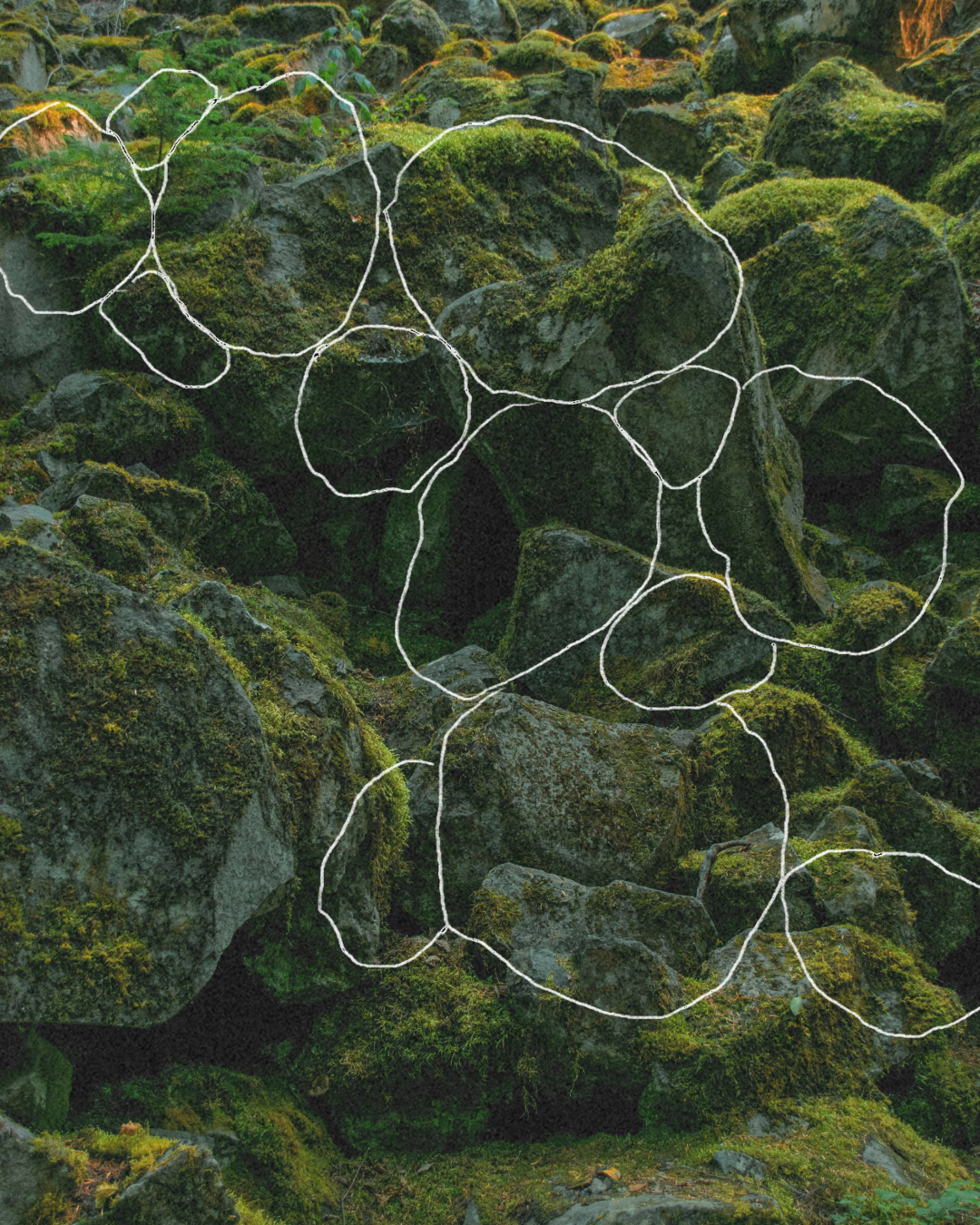

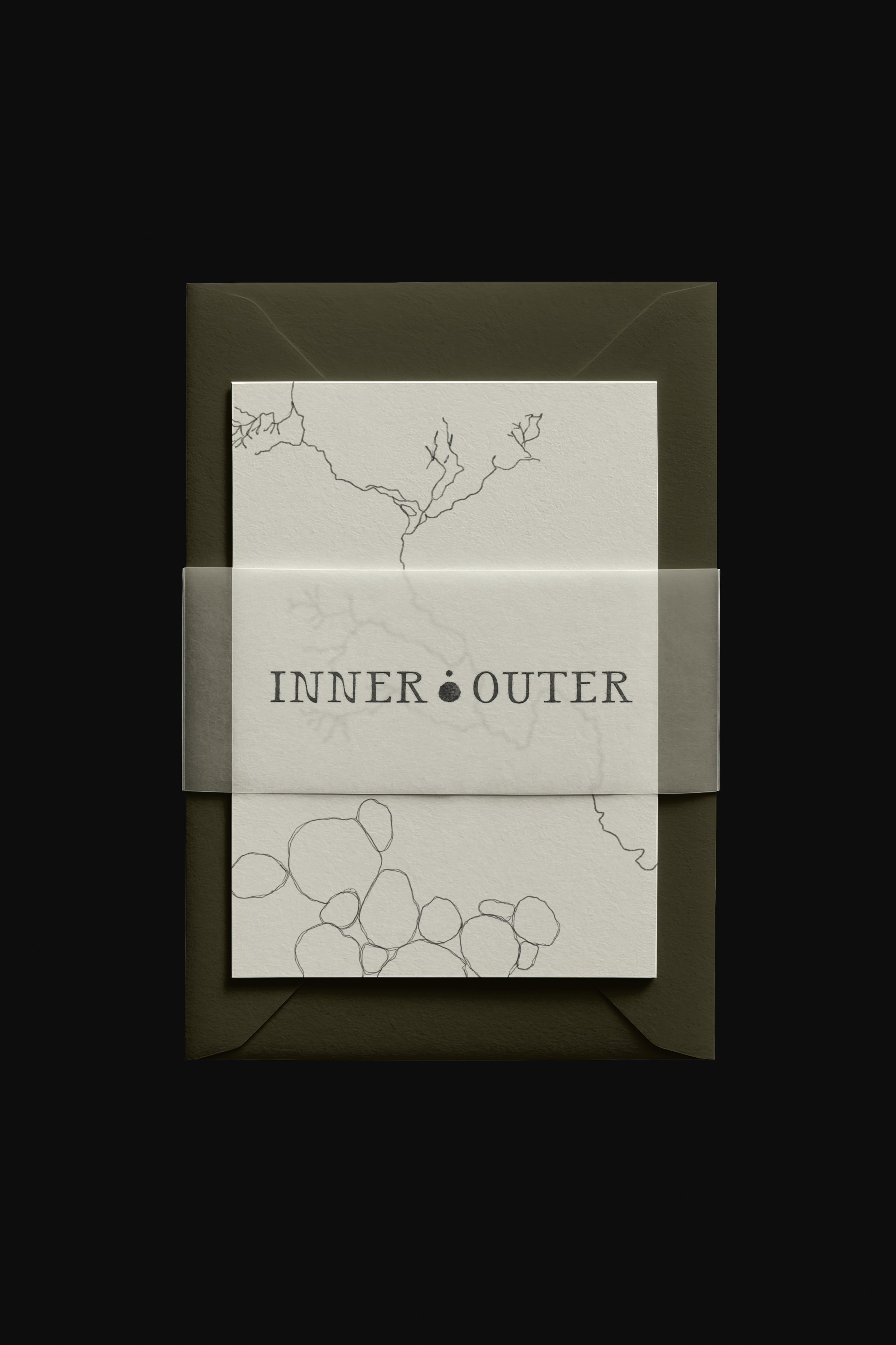
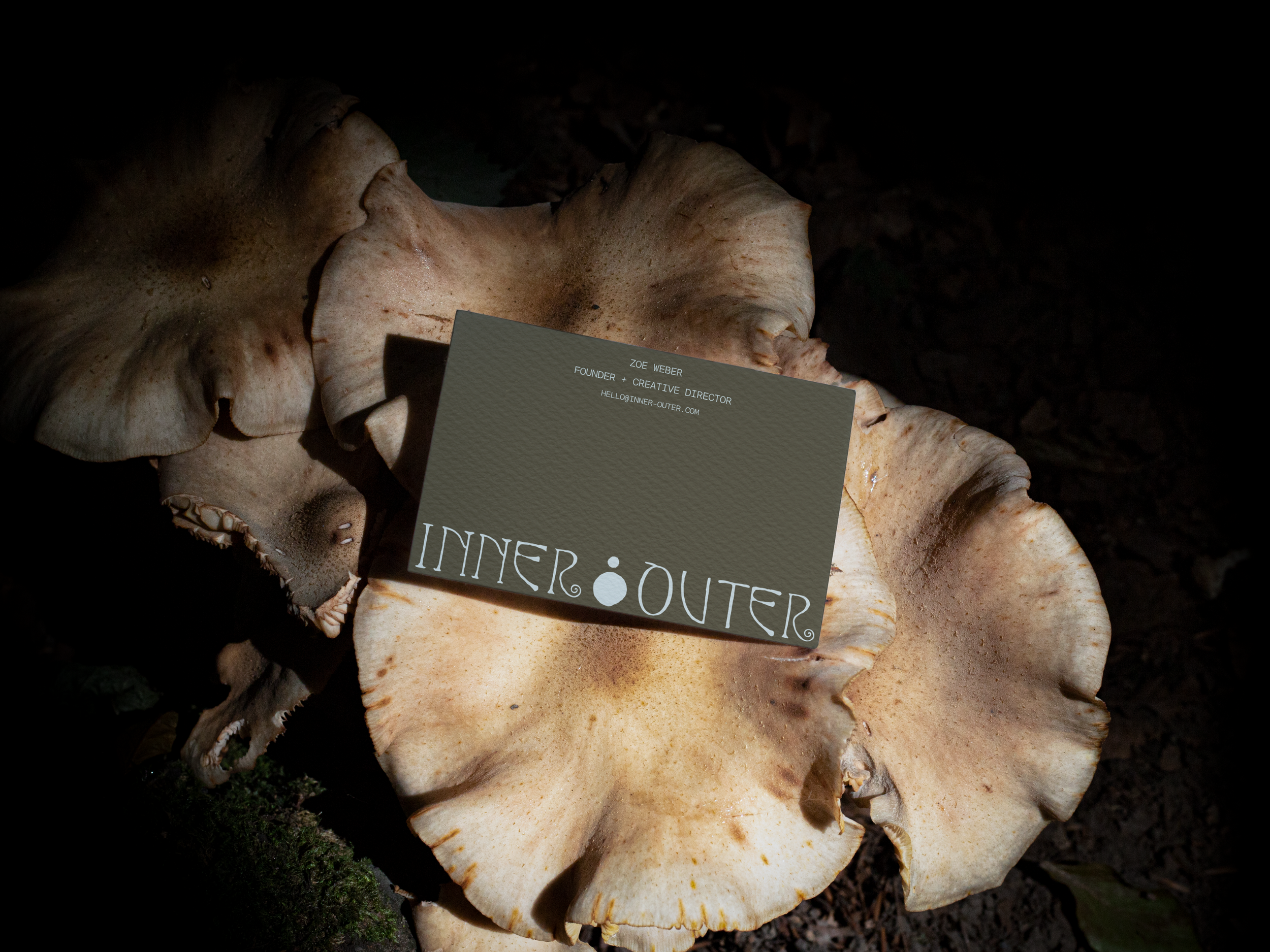
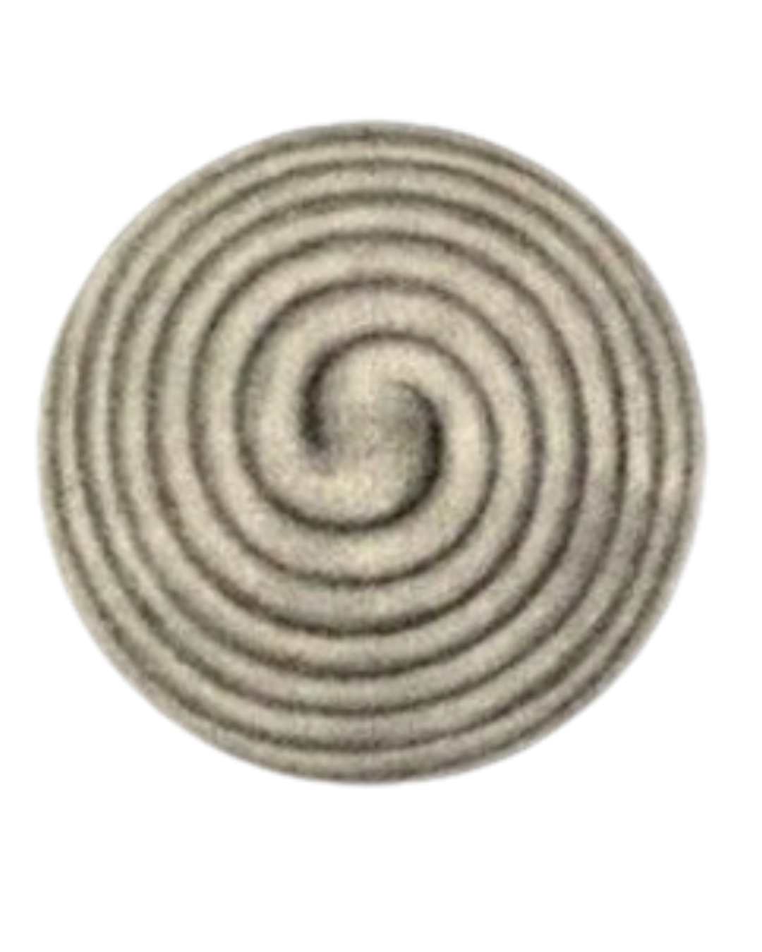
The logomark symbolizes the depth and intimacy of the inner world, and the expansion and connection of the outerworld — visualized as a smaller “inner” circle and a larger “outer” circle.