Hallie Havican
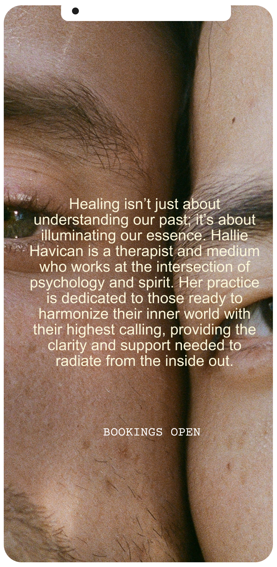
Hallie Havican is a therapist medium merging the tangible depth of therapy with the intuitive transformation of mediumship to empower the LGBTQ+ community and visionary seekers to reclaim their most radiant, integrated selves.
Hallie Havican
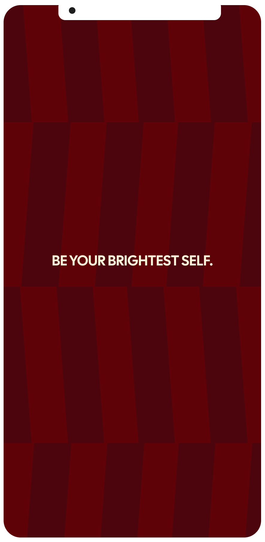
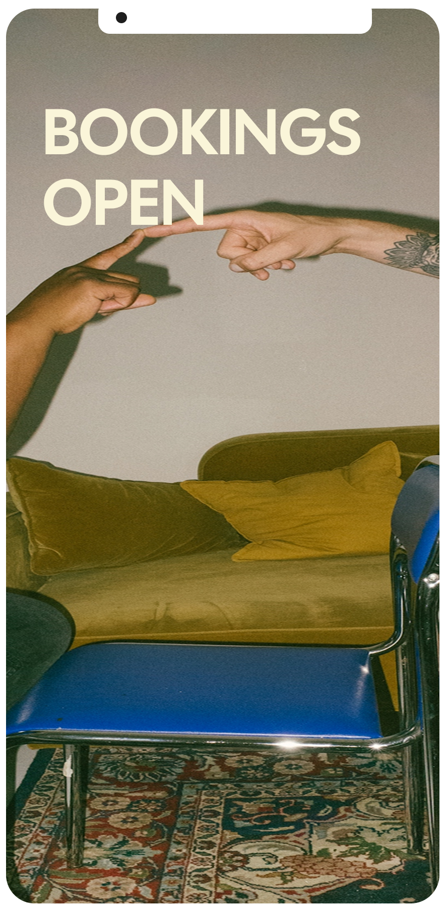
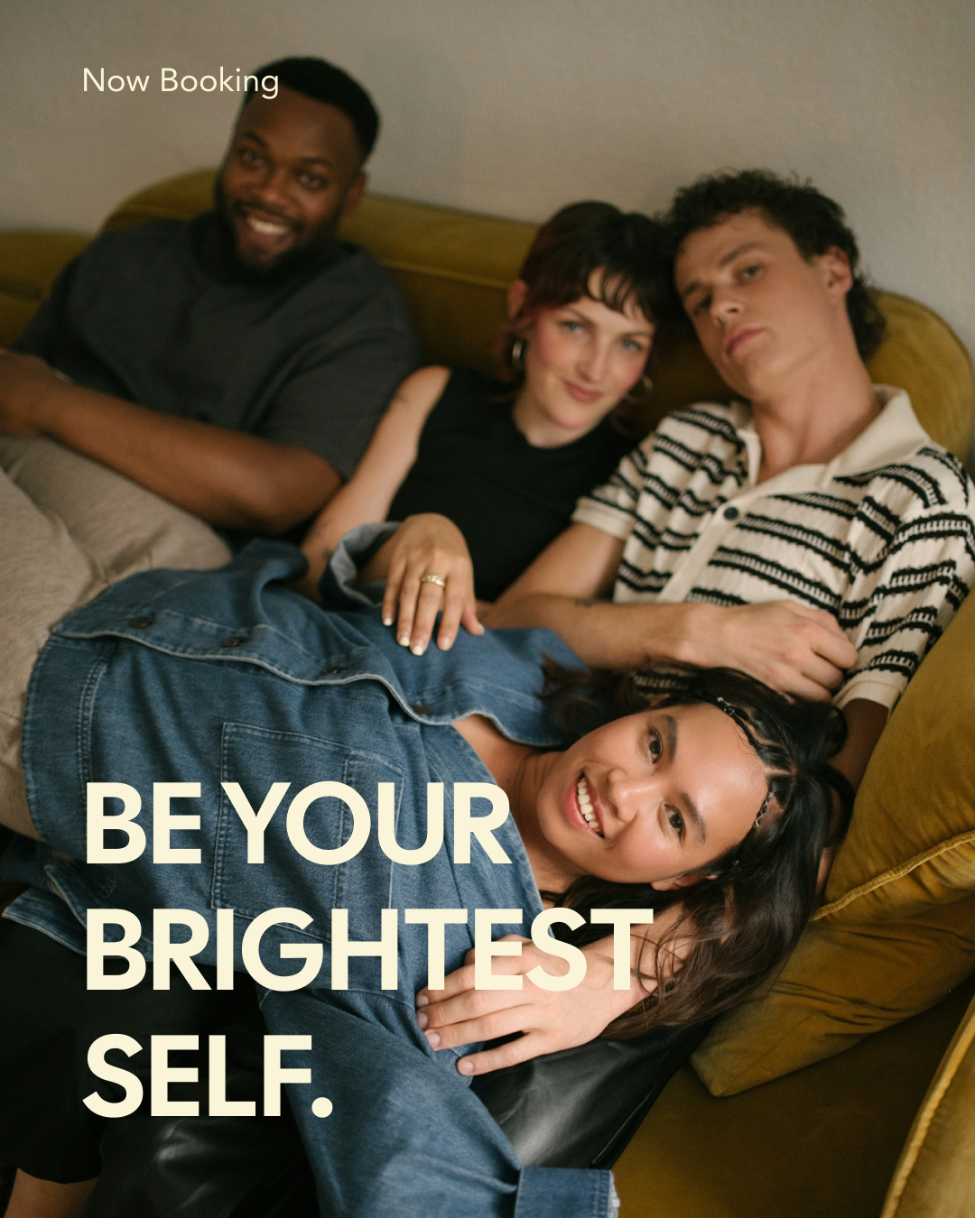
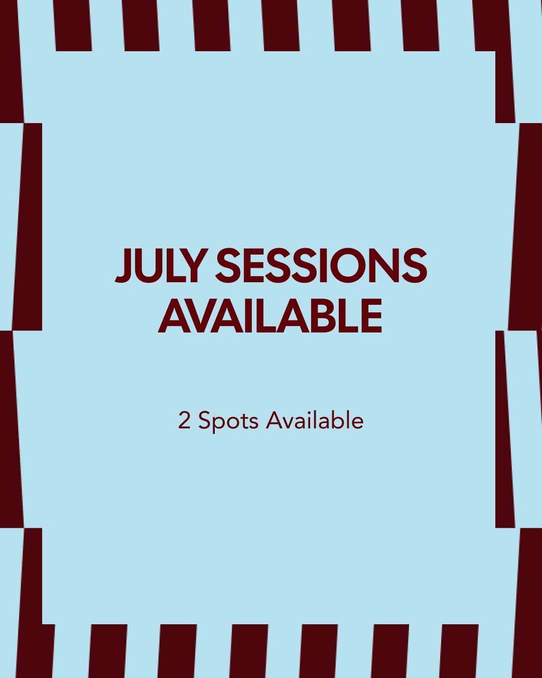
“Be your brightest self.”
OVERVIEWHallie Havican occupies a singular space in the healing arts: she is both a grounded therapist and a gifted medium. For years, these two worlds lived in parallel, but Hallie reached a threshold where she was ready to unify them. She came to us at a moment of professional expansion, seeking a brand that could hold the tangible and somatic side of her therapeutic work alongside the intuitive and ethereal depth of her mediumship. Her vision was clear—to help her clients step into their brightest, most radiant selves—but her existing brand lacked the sophisticated infrastructure to support her next level of scale.
THE CHALLENGE:
The challenge lay in the "and." Hallie needed to be seen as a professional authority without dimming her intuitive light. She feared that a clinical brand would feel sterile, while a purely spiritual brand might lose the grounded, educational edge that makes her work so effective. Our mission was to architect a visual world where science and spirit didn't just coexist, but actively empowered one another.
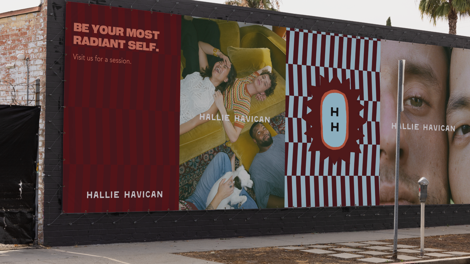
SERVICESVISUAL BRANDING
MARKETING ASSETS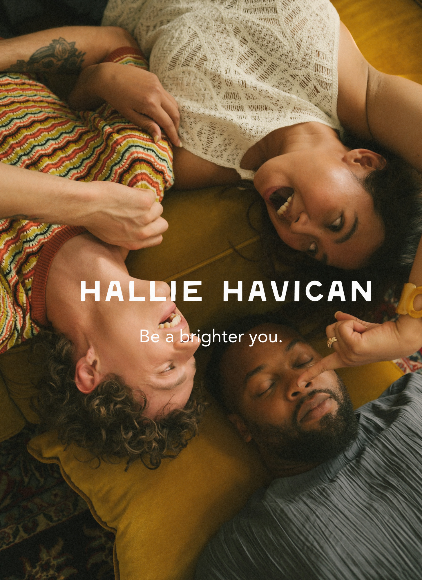
THE APPROACHTo move Hallie from bi-lingual identity to a unified force, we utilized our Intuitive-Strategic Framework to find the visual frequency of her specific magic.
We identified the spirit of Radiance as the brand’s North Star. We wanted the brand to feel like the first light of dawn—a moment of profound clarity, warmth, and the awakening of one's highest potential.
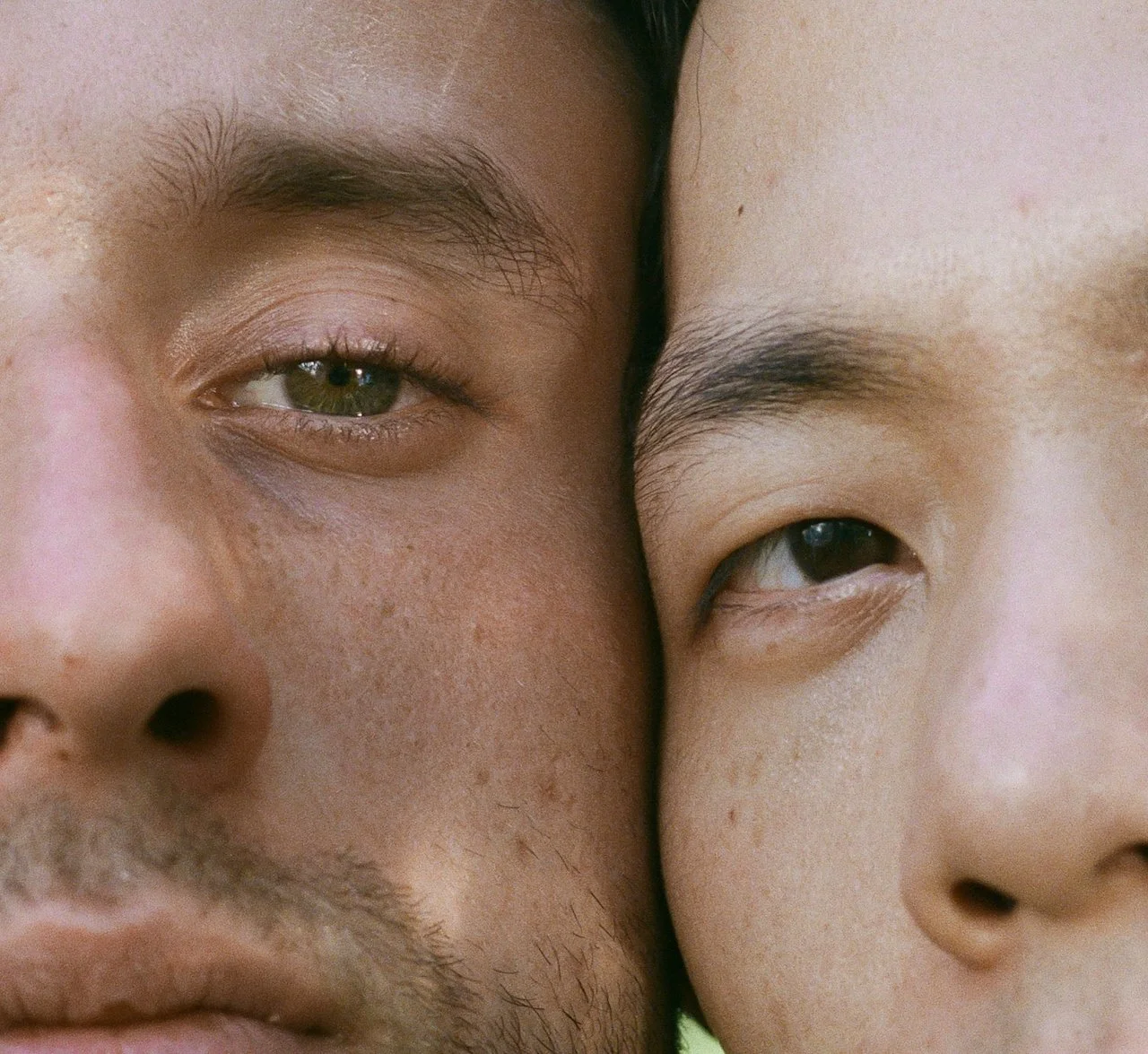
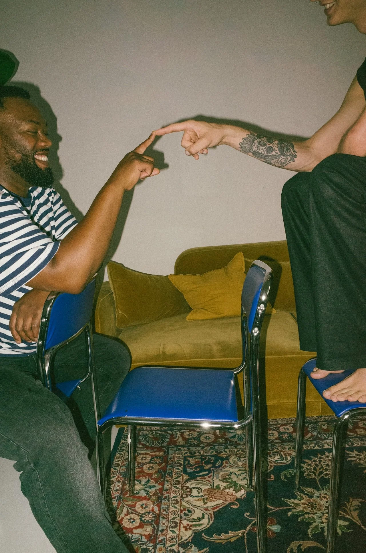
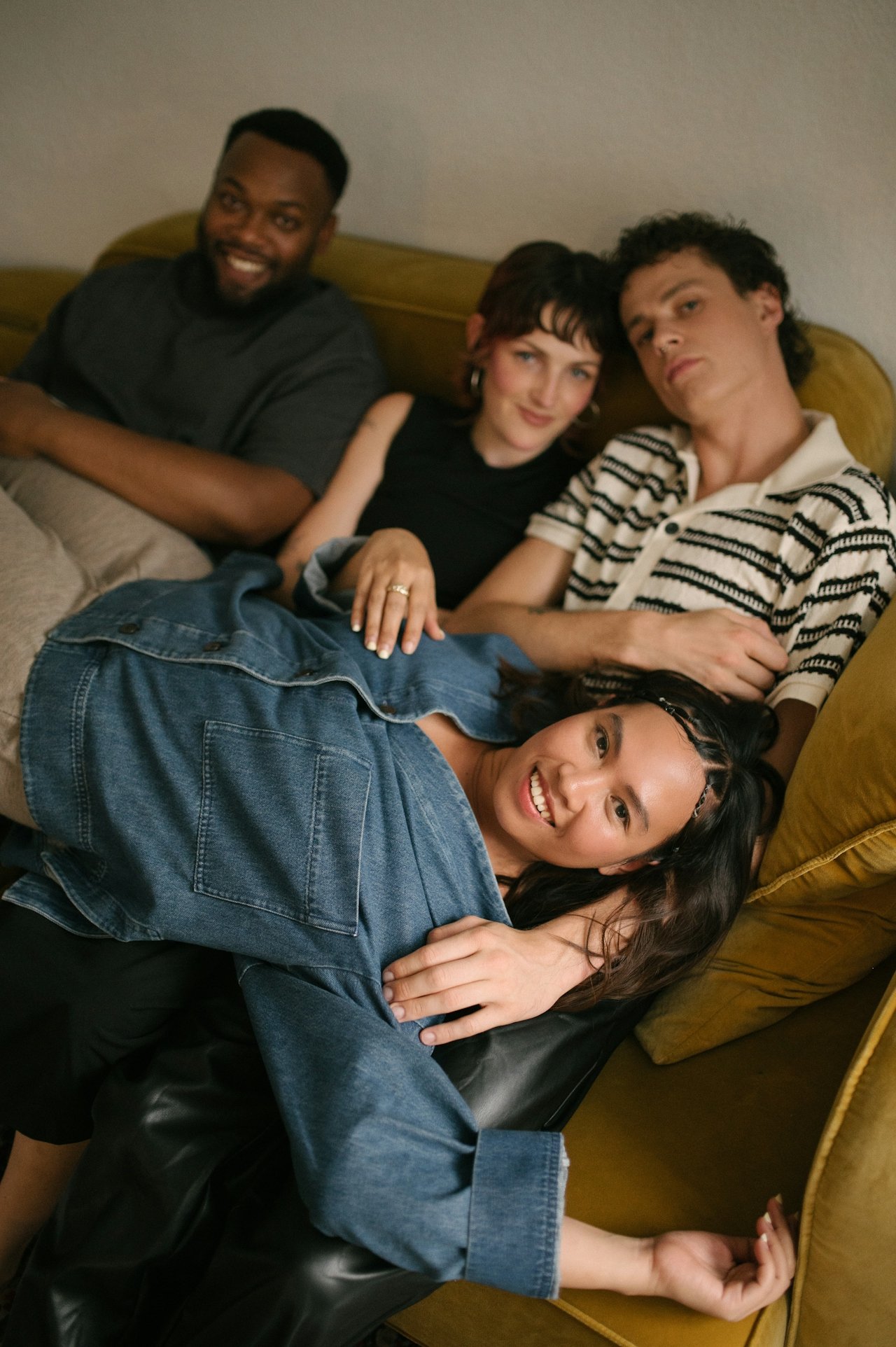
Knowing that Hallie’s heart is deeply rooted in serving the LGBTQ+ community, we prioritized the feeling of safety and approachability in the design. We moved away from the cold, clinical feel of traditional therapy and instead built a brand that feels queer-affirming, soft yet strong, and profoundly welcoming. We aimed to create a space where belonging is felt before a single word is read.
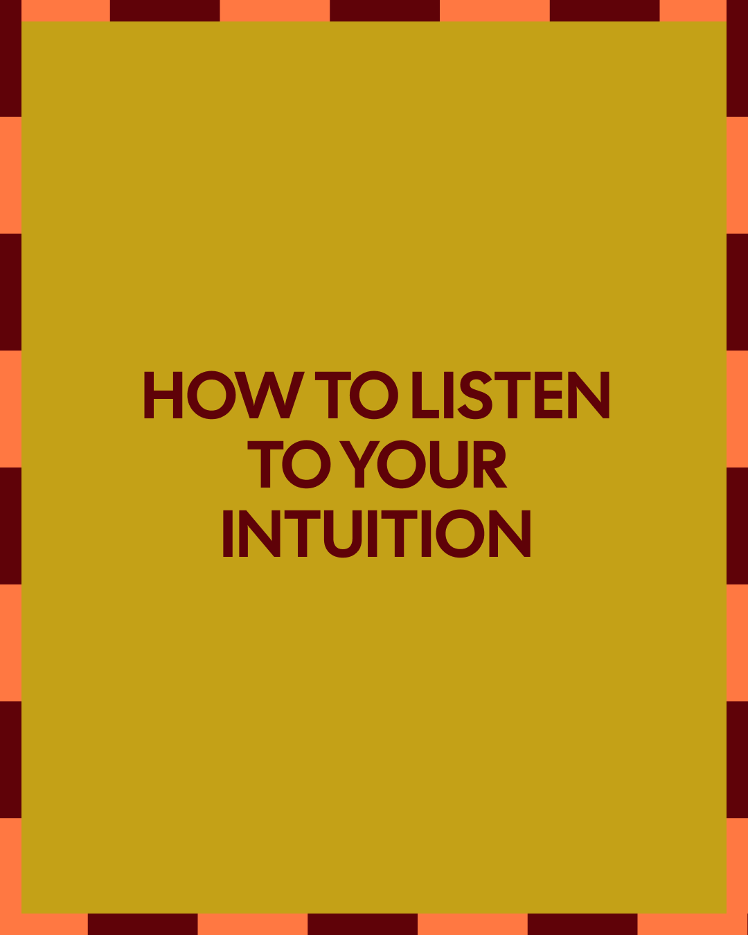
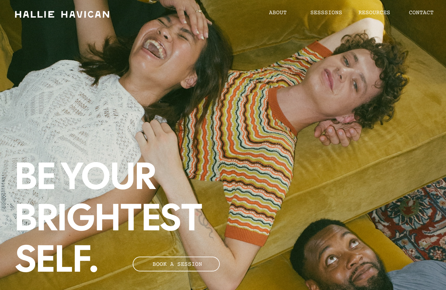
We paired clean, sophisticated editorial layouts with organic, light-filled textures.
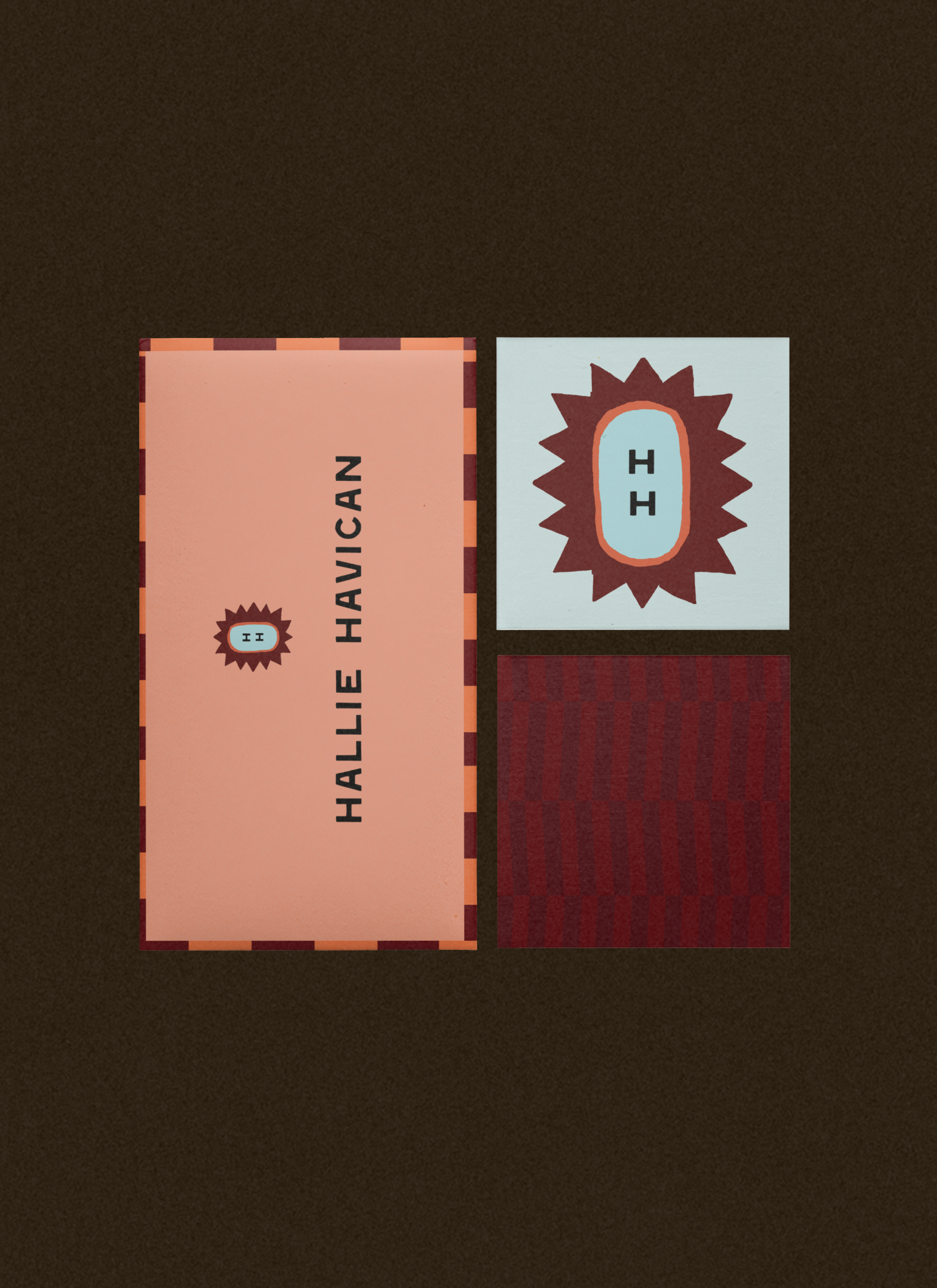
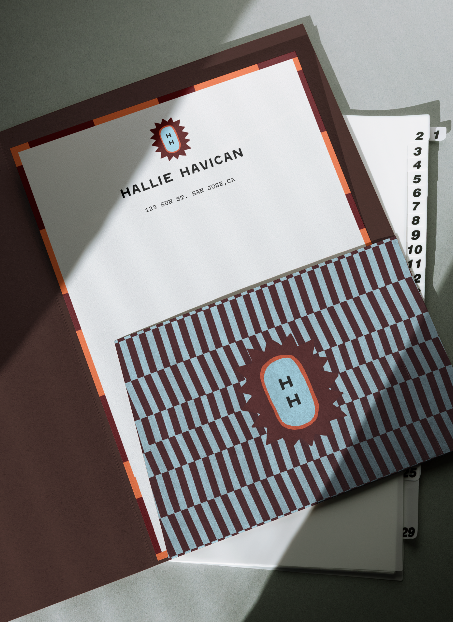
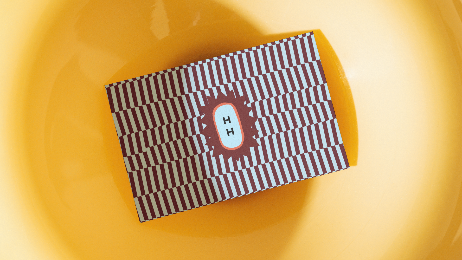
We chose a logo and font system that feels established, yet fun, providing the professional structure for her intuitive gifts.The sun submark in the logosystem served as a symbol of the brand’s purpose to help people be their brightest self.
We leaned into warm, earthy tones with a touch of retro-inspired color to add dimension and sophisticated playfulness to the brand personality.
The outcome was a brand that felt professional and grounded, while remaining approachable and inclusive.


THE TRANSFORMATIONThe evolution of Hallie Havican’s brand was an act of "coming home" to the full breadth of her power.The result was a total reclamation of her professional identity. By finally integrating her intuitive gifts with her tangible expertise, Hallie moved from the friction of a disjointed business to the ease of a cohesive, high-performance brand. This newfound alignment gave her the internal "green light" to scale with absolute authority. No longer having to hide one side of her work to protect the other, she stepped into a category-of-one status that commands a premium in the healing space. Hallie didn't just professionalize her business; she built a radiant beacon that allows her community to see—and claim—their own light.