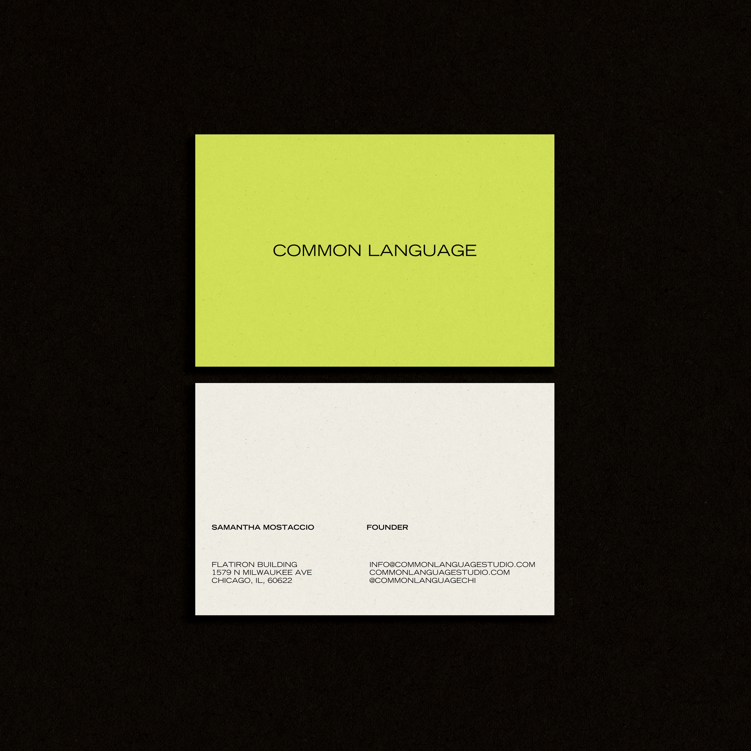
Common Language
Common Language is a Chicago-based wellness studio and home away from home where creativity, culture, and community intersect. CL created their own sound-driven rebounding and sculpt method designed to revitalize the spirit and the body for whole-body wellness.
Common Language
OVERVIEW“Experience the shared rhythm that connects us all.”
Founder Samantha reached out to us at a pivotal moment. While she had built a loyal community in Chicago, she was facing a common founder hurdle: brand misalignment. The business had evolved, but the visual identity felt stuck in the past—leaning "juvenile" and failing to capture the high-energy, athletic edge of the actual class experience. This disconnect was causing burnout and making growth feel like an uphill battle.
THE CHALLENGE
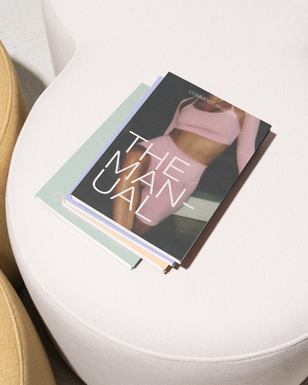
Common Language needed an identity that felt as sharp and high-octane as a sound-driven rebounding class. The mission was to overhaul the color palette, typography, and creative direction to attract a more sophisticated, edgy demographic. Beyond the aesthetics, they needed a high-performance digital home and a professional, printed training manual to facilitate the scaling of their instructor programs..
THE RESULTS:
A re-invigorated brand that built a new foundation for brand loyalty
A cohesive visual world that represented the true culture of the brand that would connect to CL’s target audience
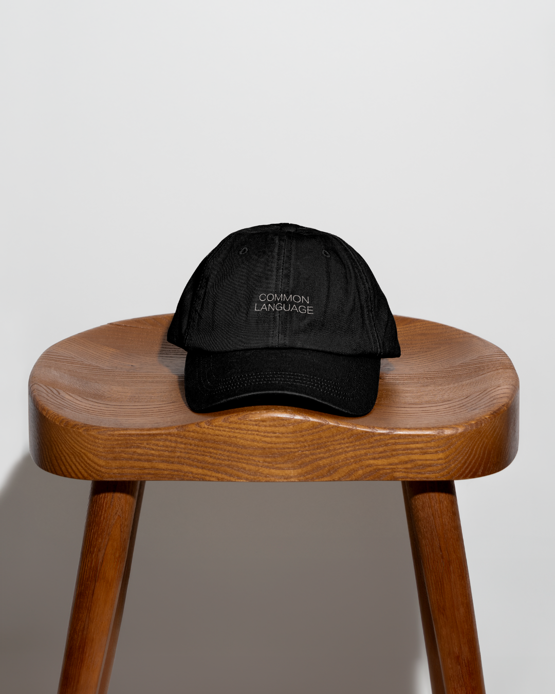
SERVICESVISUAL BRAND REFRESH
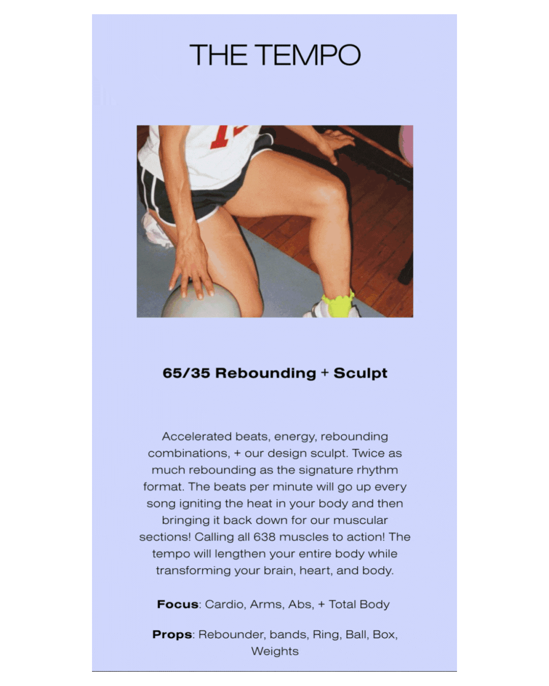
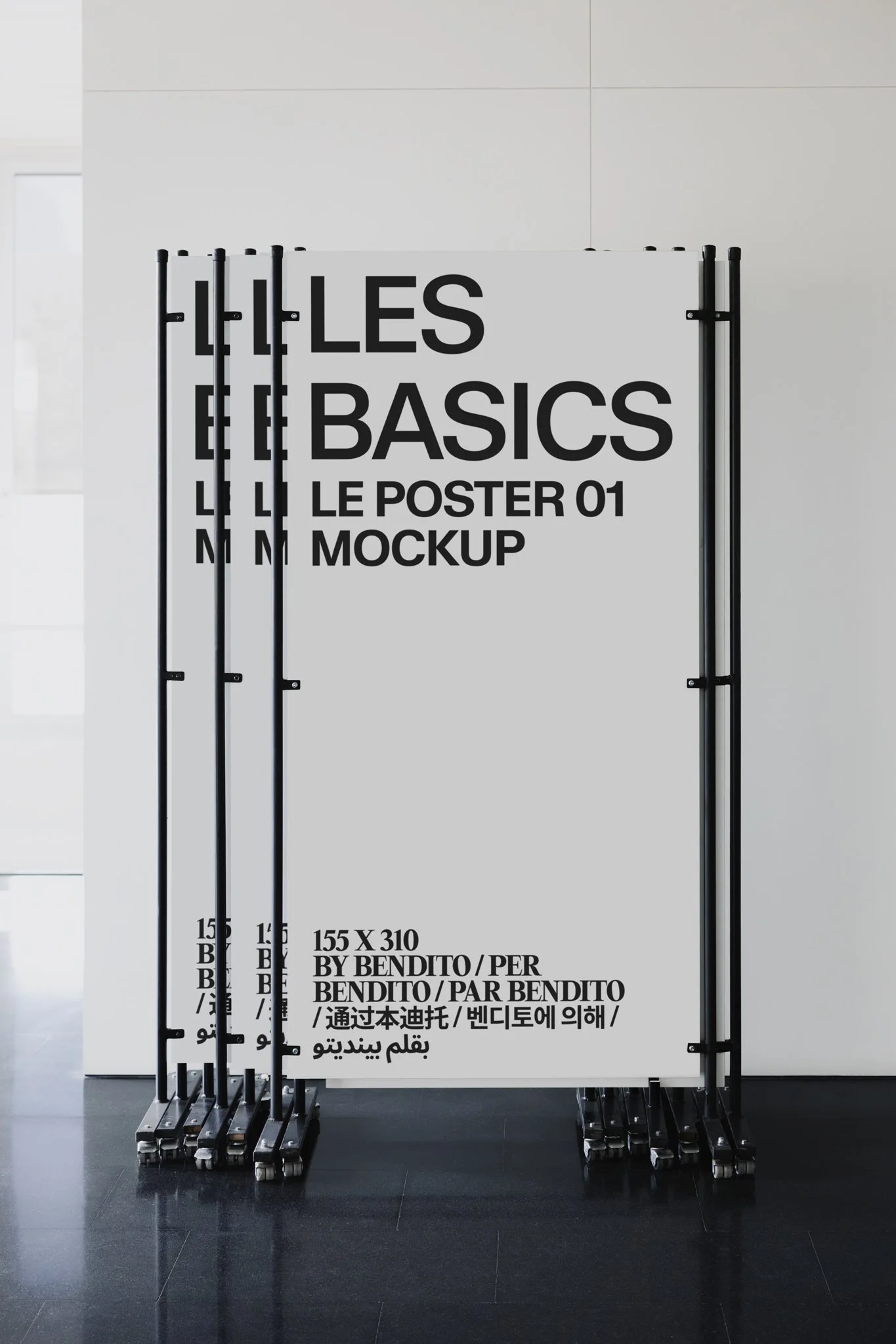
BOOK DESIGN
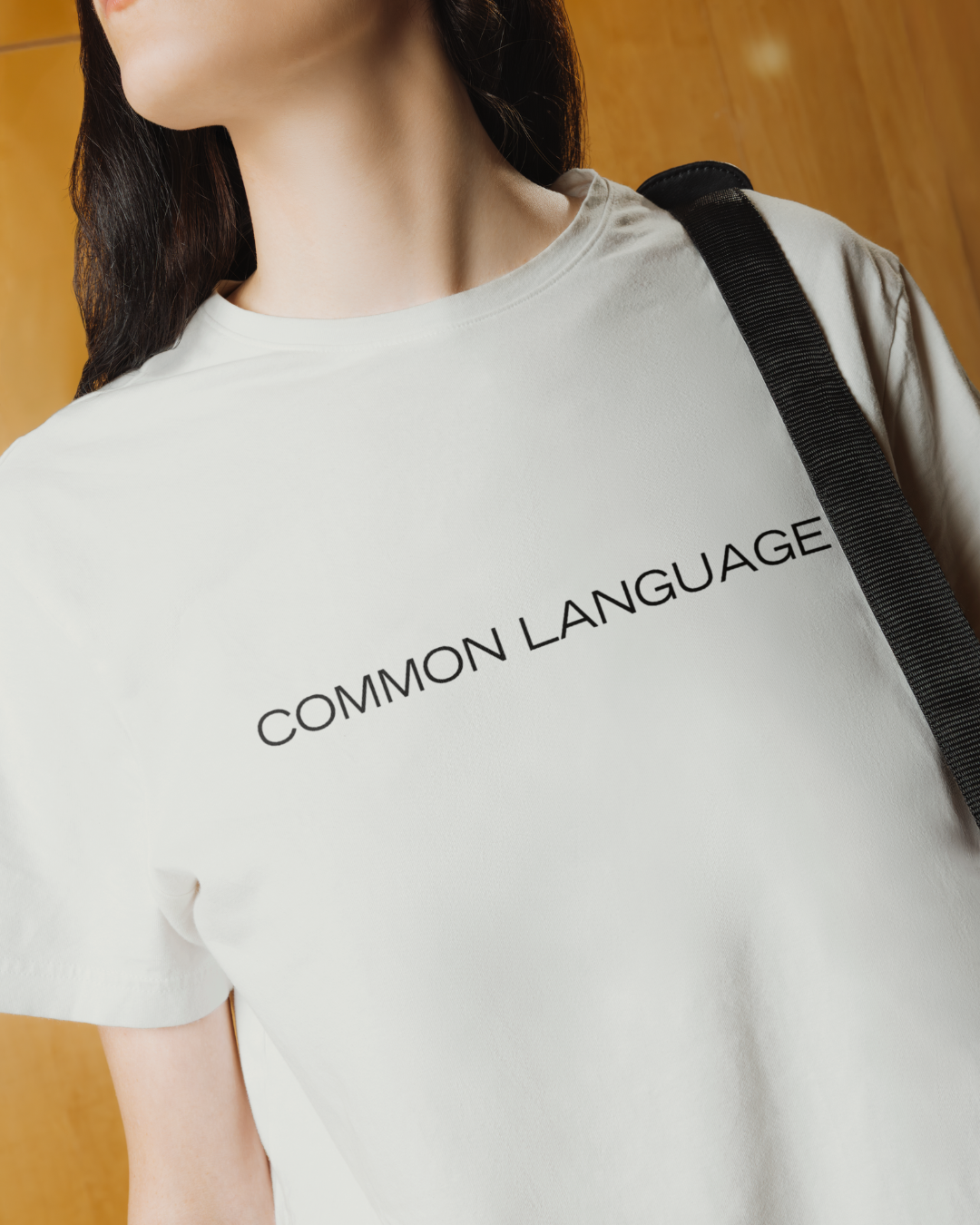
MARKETING ASSETS
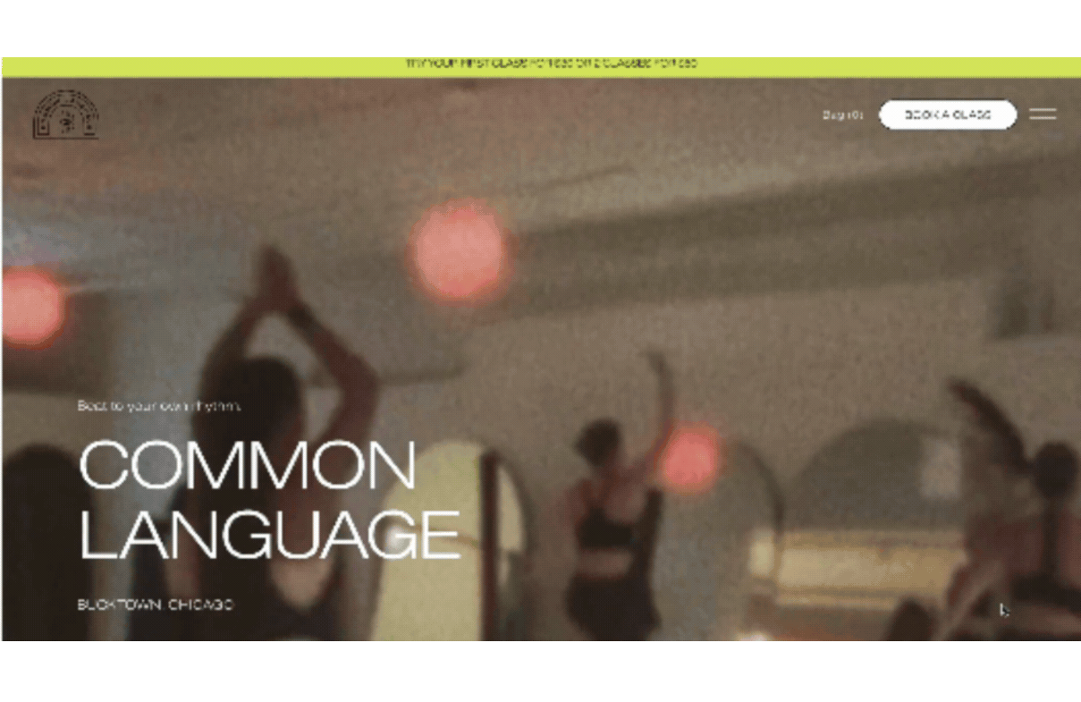
WEBSITE 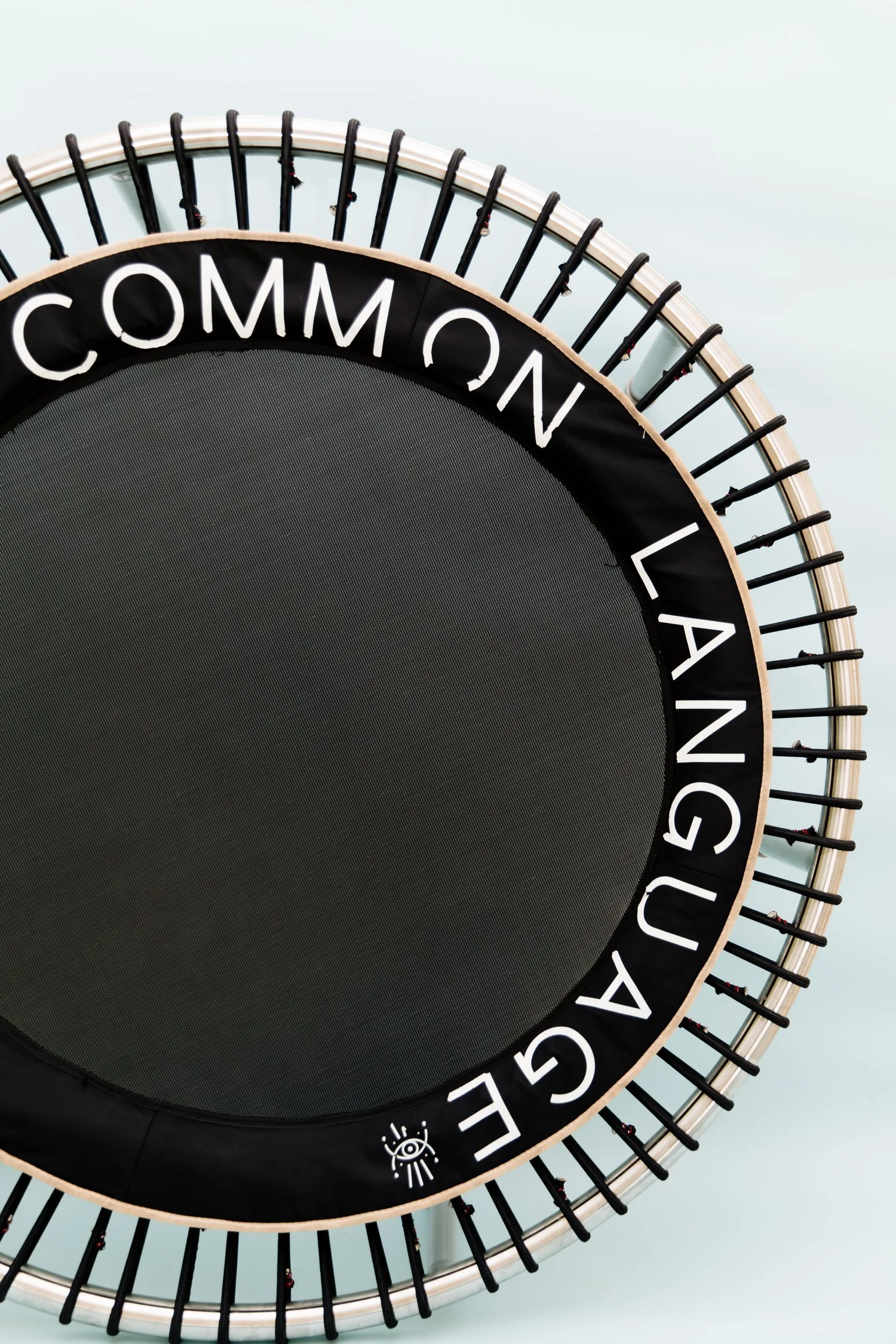
THE APPROACHTo revitalize Common Language, we utilized our Intuitive-Strategic Framework to pinpoint the exact "after-state" of a CL class.
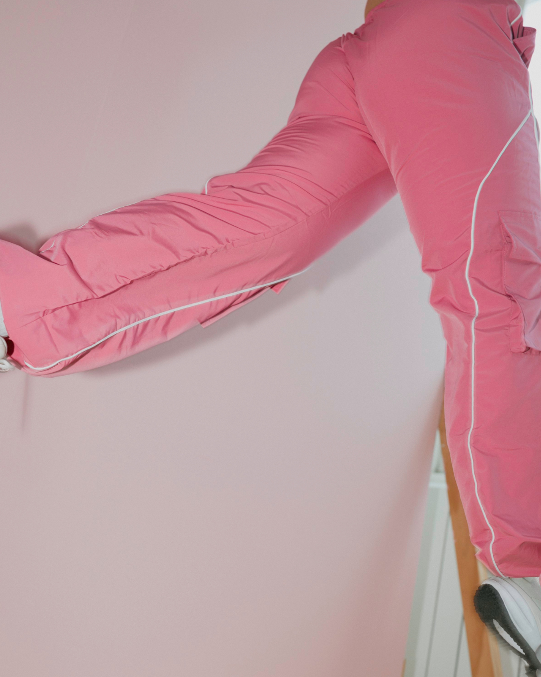
Through our signature visual exercises, we identified the core feeling every student should experience: The Electric Plunge. It is the sensation of diving into the ocean after the sun has warmed your skin and sweat is rolling down your body. It is refreshing, energizing, and electrically alive. We reworked every touchpoint of the brand to encapsulate this precise energetic frequency.
We focused on building an identity that was simple enough to be iconic, yet edgy enough to be distinct.
While honoring the original logomark, we designed a new logotype that is sharper and more sophisticated, built for long-term brand recognition and scalability.
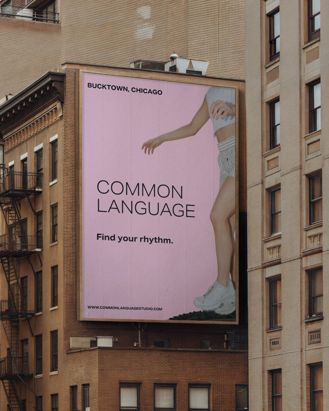
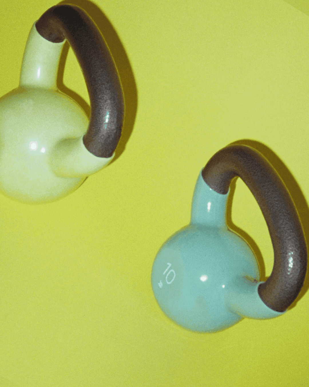
We injected the brand with a dose of high-voltage energy by introducing a Bright Electric Pink. This became the defining anchor of the palette—a strategic choice to build instant recognition and provide a bold, athletic contrast to the softer, secondary tones.
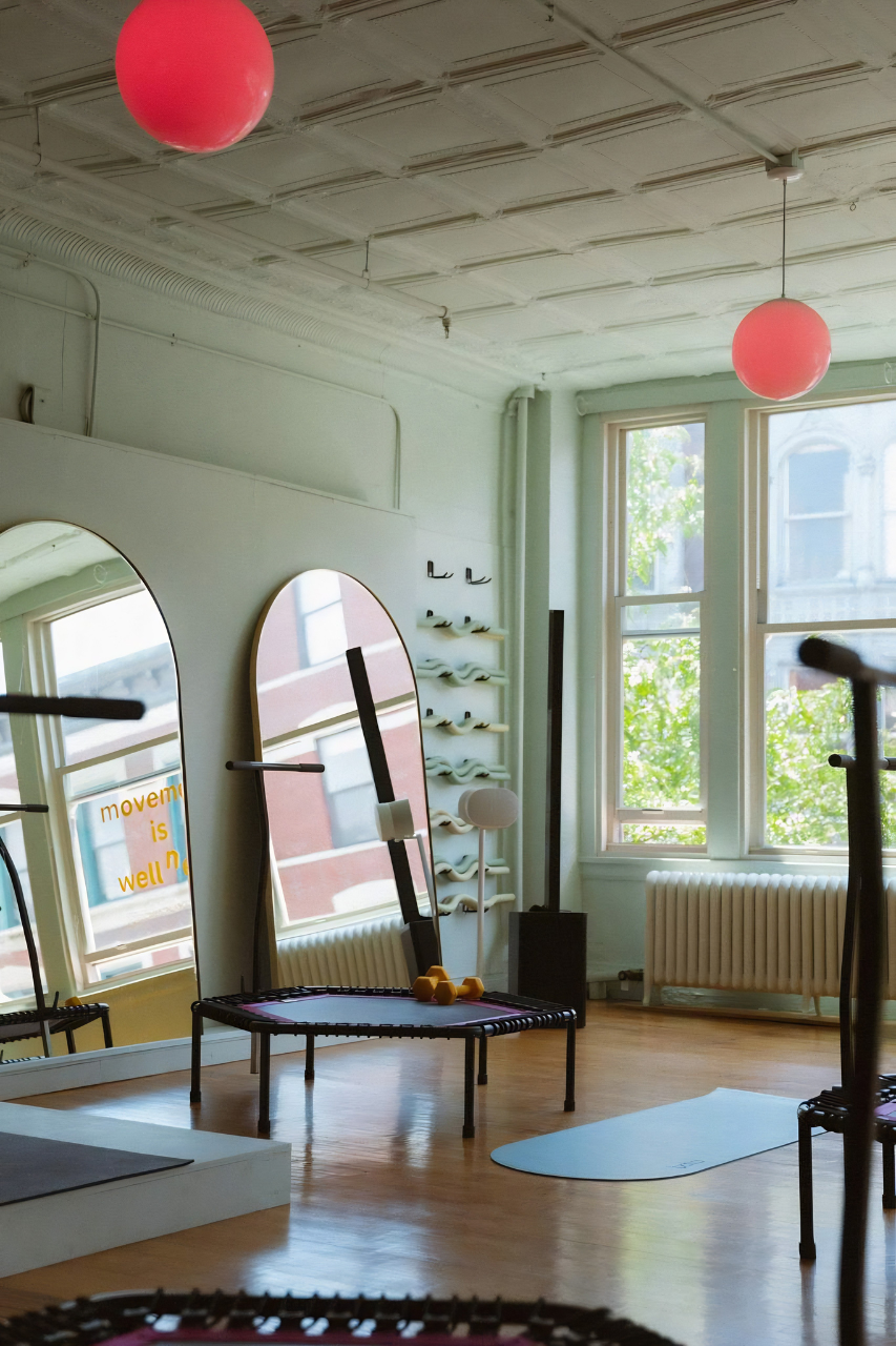
We moved away from "static" fitness imagery toward a more visceral style. The new direction focuses on the intensity of the work: the equipment, the movement, the sweat, and the raw power of the CL community.

THE OUTCOMEStrategy only works if it's applicable. We translated the new brand world into a comprehensive, printed training manual. By treating the educational materials with the same level of design rigor as the website, we positioned Common Language as a premiere training authority, ready to scale their method to new heights.